
Define Research Goals
In this case it was obvious that we wanted the site to convert visitors into customers, but some less obvious user goals had to do with how well they understood the product and its installation.
This was in addition to making sure new branding wasn't going to cause any adverse effects.
Determine Method
In the past 25 years, I have utilized many ways of conducting usability studies. There are two main distinctions:
-
In person moderated
-
Remote unmoderated
There are pros and cons to each method. In person moderated is great for getting high fidelity findings and "going deep" on specific features and details, but remote unmoderated test have the advantage that they can be scaled -up to have a larger number of participants.
For this test I choose to do remote unmoderated usability tests. I used UserTesting.com to manage recruitment and test capture (metrics and video).
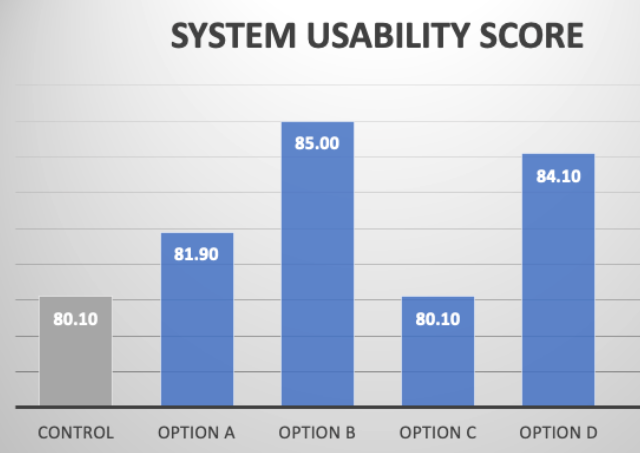
We used SUS (System Usability Scoring) to determine an overall usability metric, but behavioral and spoken feedback where just as essential in the final analysis.


Design Challengers
I worked with other designers to create optional interfaces of the same experience that carried the brand well and would hopefully improve performance.
There was hope that one would have clear advantages, but at worst we would still have actionable findings that might help the site convert better.


Create Prototypes
For the test to be of worth, the interfaces for all of the tests needed to be rendered at the same fidelity and have stable performance.
After the challenger interface were designed, I choose to use Axure (totally different from Azure) to create prototypes of each experience needed including the control (the existing interface).


Get Participation
For this test I choose to conduct remote unmoderated usability tests.
We determined a number of participants for each of the challenging interface and the control group (existing interface). I prepared a screener to recruit the participants that would fit the determined demographic. I used UserTesting.com to manage recruitment.
In addition to things like age and gender the screener asked specific questions designed to qualify or disqualify participation. Like "Do you or does anyone in your household work for a telecommunications company? "

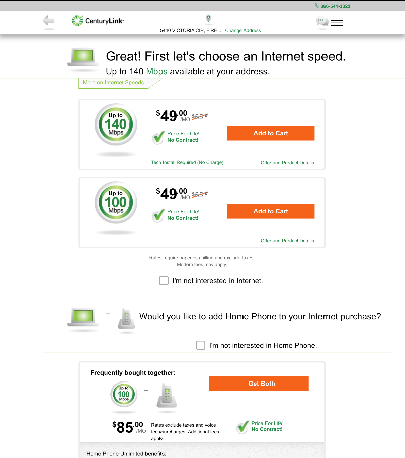
Crafting a Realistic Scenario
The scenario for our needs was basic, but we still needed to put some specifications around it just to make sure all participants are aimed in the same direction. After landing the participants on one of the challengers or control, we told all participants:
"Do not provide any real information. Show what you would do on this website to see what internet speed you could get at a home or small business. We will pretend your address is:
1281 E GREENFIELD CIR MURRAY UT 84121"

Analysis
The system usability scores showed two challengers performed much better than the control, but in order to see which would convert better we would need to analyze what people said and what they did.
By looking through the footage and analyzing the transcript It was determined that elements from multiple interface challengers added to the users understanding of the product and the value.
Rinse and Repeat
In the end we ended up with a better performing interface without adverse effects by combining our learnings and retesting then refining the interface.
After every repetition of this research process (or similar) we improved our sales. I did this for the CenturyLink brand for over 10 years.